Monday
Thursday
Billboard Sizes
Size | Price | Dimensions | ||||||
|---|---|---|---|---|---|---|---|---|
4 Sheet Billboard Posters | £30.00 | |||||||
6 Sheet Billboard Posters 1200mm x 1800mm | £40.00 | |||||||
12 Sheet Billboard Posters 3048mm x 1524mm | £60.00 | |||||||
16 Sheet Billboard Posters 2032mm x 3048mm | £80.00 | |||||||
32 Sheet Billboard Posters 4064mm x 3048mm | £120.00 | |||||||
48 Sheet Billboard Posters 6096mm x 3048mm | £140.00 | |||||||
64 Sheet Billboard Posters 9129mm x 3048mm | £175.00 | |||||||
96 Sheet Billboard Posters 12192mm x 3048mm | £300.00 | |||||||
Alcohole Advertising
Key rules for alcohol advertising
Ads for alcoholic products should not:
- encourage excessive drinking
- have a strong appeal to those under the age of 18 years old
- imply that alcohol has contributed to sexual or social success
- show alcohol being handled or served irresponsibly
- feature those who are, or appear to be, under the age of 25
- place undue emphasis on alcoholic strength
Key facts about alcohol advertising regulation:
- Specific rules for alcohol advertising have existed since 1975 and were last updated in 2005.
- The ad industry is responsible for writing the rules through two bodies – CAP and BCAP.
- Ads for TV and radio get pre-vetted and CAP’s Copy Advice service advises on compliance with the Codes for ads in other media.
- In 2007 the ASA resolved 273 complaints about alcohol advertising.
- Compliance with the rules is high: an ASA survey in 2006 found 94% of alcohol ads complied with the rules.
- The ASA works closely with the Portman Group, which regulates the naming and packaging of alcoholic drinks.
Wednesday
Brief
Monday
Friday
Repitition
Special Shooting
Successful shooting
Thursday
Bowling??
Complications

I have had many problems with my project already, some down to poor project management on my part i.e. timing as seen in my poor footage which is unusable due to lighting. Another problem which has held me back in this project is that of the weather, as I am shooting outside with a camera that's not mine I will not be able to shoot in rain which we seem to be having a lot of recently, and seeing as I need to find free time which coincides with my friend who will be staring in my footage, it's proving difficult and is delaying the process.
Wednesday
Poor Footage
Initial Shooting
No 5
http://www.youtube.com/watch?v=d_ZgwGXdi2o&NR=1
Finally a faster paced video which I found during my research which I will really be able to use in terms of ideas and shots for my video. Though I intend for my video to be faster as we have 20 or so edit points to account for and no music track as I hear in many of these videos . I will have to work with natural and ambient sound whilst also finding my own sound to add in for effect
No 4
http://www.youtube.com/watch?v=bG_UDYtNXUo&NR=1&feature=fvwp
An old Nike running advert which we can all enjoy for its comedic content also adds to the ideas which may be used in my sequence
No 3
http://www.youtube.com/watch?v=m474JNTLKnQ
Nike running offered me an insight to naked running which isn't that helpful as I do not wish for my subject to be naked though once again it has offered me some useful techniques for my 15 second video though these videos are longer I am taking inspiration in shot that I will copy.
No 2
http://www.youtube.com/watch?v=nL_HvozJiQw
I also took inspiration from free running videos as they offer many ideas for shots I can go on to incorporate in my video, though this is mearly from an aesthetic point of view as i will not be doing free running but it's key to get a taste.
No 1
http://www.youtube.com/watch?v=NRtEKScYu9g
My first piece of research which came to mind immediately was the running scene from what women want, as I remembered this from a while back I thought it would be of some help for shot ideas, themes and feels which I could attempt to portray in my project
Ideas
Crash Band Wallop
Thursday
Interview
I was supposed to have two interviews one with a student and one with a teacher but whenh i arrived only one of my people turned up, Clair Broad.
planned questions and talking points
What do you do here at College?
Do you enjoy what you do?
What specifically do you enjoy?
What does that involve?
Why you chose to become a?
How do you manage the work load?
as a mother?
whilst work? full time or part time?
Do you have any specific difficulties?
What problems have you had to over come?
Are you happy with how the course works?
what and why would you change?
Do you find it hard meeting deadlines?
I'm hoping to get some good responses from my questions, i would really like it if she just kept talking so as to leave me with loads to edit down
New Project
this project doesn't seem that exciting as it's quite restrictive but it's necessary as a client may want this one day.
hopefully i learn some more editing techniques and improve
Tuesday
Bottle
Natural Fizz

One of my favourite designs that i may run with. I used the font Apple Casual as it's soft and has great rounded edges. The stroke makes it seems more cartoon and i like that as i'm aiming for that with my project. the bubble are there to portray fizzing, though they could be moved or even taken out i am unsure as of yet
Character
Vimto Logo

Vimto Logo is a very good example to get inspiration from it uses many components and seems very busy though it's still really easy to see as they have used a bold red font for 'vimto' out lined with a bold white to make it stand out laid on top of the liquid vimto spilling out on top of fruits used, this style portrays motion and works well with the brand with expert uses of gradients to add shading and shape.
advertising - Vimto

Picture ad campaigns are a great time to be creative and i love what vimto have done here, by clearly using photoshop they have made the can look like it's 'exploding with goodness' they have also digitally added in bits of fruit which are not actually in the can. Not the hardest image to create but it's a good idea and is presented well for good publicity.
Advertising - Fruitshoot


Many companies advertise on the bus and Fruitshoot are no different but they have just completely covered the bus which will get seen, i especially like he back of these busses with what is made to appear like the Fruitshoot bottle is exploding through and adding motion by having oranges around it with bright lights moving away from the bottle, very exciting advertisement
Research Bot Beverages


I will split my research between my blog and my book and here is some advertising done by Bot beverages for there soft drink. This advert is funny and straight to the point it uses a obvious technique by simple saying 'Bot is good' which is the point of all advertising campaigns. There is a collection of funny Bot adverts using a shark, oboe and lawn darts all done in the same way.
http://commercial-archive.com/ooh/bot-beverages-lawn-dartspet-sharksoboes-2008-print-usa
New Project
Content
New Project
Thursday
Home
Heading
i have used a heading with a bit of colour, not in the text but in the background. as i think this makes the text 'pop' better. using a black text over colour helps stand out unless the picture is dark plus it ties on with text and other elements of my page. thin black stroke to help separate from others, same style to my photos on every page.
Navigation
i have gone with a simple box same colour as my background as i like how it looks. it's a simple design which came about from many complex designs which i didnt like, in some peoples eyes these stylings may be wrong though i spent ages on my buttons as i couldnt find a type i was happy with until i settled on this one. colour, off black as i want it to stand out against the light grey but not to harsh so not to distract attention.
Content
simple copy and paste type which had to be moved around in CSS a few times until location was alright.
Wrapper
the wrapper is something which i found very easy and yet think it looks really good and is key in any new websites breaking through. naturally i placed it in the center to accommodate to different web browsers.
Image
i have chosen strong images for my site as i wish it to look as new as possible, i wasn't to happy when looking through and finding loads of old pictures. this picture truly glamorizes public transport. once again thin black stroke merely to look better, serves no true purpose.
Title
Heading
working hard
Buttons
I created my buttons in Photoshop where i was able to save for web into my desired file format. I enjoy this process as i am able to be creative and try different designs, what i like most about this is that i am able to change my designs and use the same file names and they change without any fuss. which made my designing alot quicker as i did this many times.
background
i played with my background loads in this project as i had many design ideas and lay outs, i had blues and reds and etc. yet i could never decide on any.... i started researching more and got the idea for two colours as my background, one background colour and one colour within my wrapper, shades of grey so as not to be over whealming
text
text, which i would say was the easy part as you simple copy and paste in this assignment. though there are some parts we need to remember, to make another paragraph we need tags < p > and to close < / p > i also had to play around with my styling and margins to get my text to sit where i'd like it.
Pages
Current Issues - which i think i may use as my home page.
International Perspective
Gallery - will be my page with interaction, click to enlarge
Disputes
Future Solutions
Main Problems
Beginning
Site
New Project! HTML / CSS
Friday
Ready
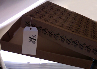 Here is my finished box and i am happy with how it has come out, i would prefer is my small Carson design covered every part of my box, but then i would have to print on all of my paper and i don't think i would be able to do it my self unless i screen printed, which i don't know how to do. all in all i am happy
Box
Thursday
Poster
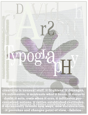 My poster was probable my favorite part of this assignment, i enjoyed constructing it from nothing, i used my own hand because it was easier, i used my hand because i thought it linked with the word typography which originates from a hand writing. i used very small faint text in the background to add depth. i also used some rough shapes as you may be able to see on the left hand side, they add depth and texture which is important when replicating Carson.
Inside
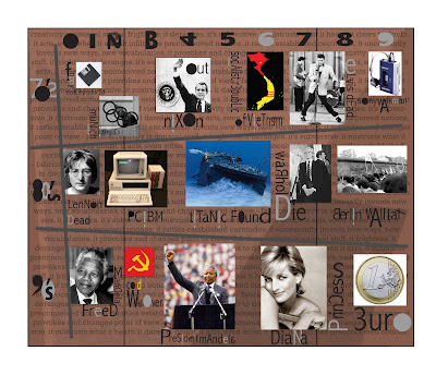 Here we have the inside of my gatefold leaflet which took ages to up load which is really annoying, i enjoyed making this as i learnt a bit about history, and design. i wanted to design it more but didn't want to over power the information from the 70's to 90's which i think was the most important part in David Carsons life
Problem!
Award Winning
Hello
nothing exciting
Wrapping Paper?
Wednesday
Trek.
Research - David Carson
Research- David Carson
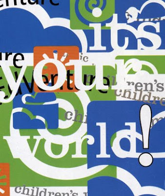 Another piece of David Carson, as you can see form the previous image it is very different with smooth rounded shapes and bright colours, there are still some consistencies like how it is very messy and hard to read, though it is different i don't really like it as much as his other works so i will not be replicating it
Research-David Carson
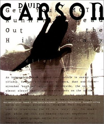 when starting research i was from the beginning sure who i was going to do as it was the only one which interested me at all, David Carson as his styles are always so different yet similar as they are rough and messy and unclear yet there is something to them as i will see. so far this one is my favorite i think it has a good composition, it's dark and light they eye is drawn to the 'CARSON' at the top. textured background adding depth, use of limited colours. i will use these techniques when making my pieces


