here is my preliminary finished home page, unless i change my mind again in the next couple of days!
Heading
i have used a heading with a bit of colour, not in the text but in the background. as i think this makes the text 'pop' better. using a black text over colour helps stand out unless the picture is dark plus it ties on with text and other elements of my page. thin black stroke to help separate from others, same style to my photos on every page.
Navigation
i have gone with a simple box same colour as my background as i like how it looks. it's a simple design which came about from many complex designs which i didnt like, in some peoples eyes these stylings may be wrong though i spent ages on my buttons as i couldnt find a type i was happy with until i settled on this one. colour, off black as i want it to stand out against the light grey but not to harsh so not to distract attention.
Content
simple copy and paste type which had to be moved around in CSS a few times until location was alright.
Wrapper
the wrapper is something which i found very easy and yet think it looks really good and is key in any new websites breaking through. naturally i placed it in the center to accommodate to different web browsers.
Image
i have chosen strong images for my site as i wish it to look as new as possible, i wasn't to happy when looking through and finding loads of old pictures. this picture truly glamorizes public transport. once again thin black stroke merely to look better, serves no true purpose.
Thursday
Title
my title i am going to use unless i change my mind again! it took me ages to make this as i had no idea what i wanted. constructing was simple. i chose and image i had used before and cropped a small part which would be in my title. i lowered the opacity so as not to be to dark and overwhelming. i used a black stroke so to match my pictures and help seperate the page. and simple typed 'Get Out of Your car' i also edited the type as well by expanding it and moving certain parts closer together i think it looks better.
Heading
here we have one of my first designs in Illustrator, from the word go i was unclear what to title my page, so i went with what it said on my brief, though its said to be not that important i may just leave it. if i can make it look good. i haven't used this design though it was on my page for a few days until i decided to chuck it. i tried the black line to separate components. i played with the size and colours until i started again
working hard
Here we have one of my first images which i collected i decided there and then that when making my website, though it was about using public transport, a pretty boring subject i would like to make ine look good, so i chose a nice image and edited it in photoshop by making it smaller, tidier and giving it a border. i also used photoshop to make to make it smaller where i used it for my gallery page.
Buttons
I created my buttons in Photoshop where i was able to save for web into my desired file format. I enjoy this process as i am able to be creative and try different designs, what i like most about this is that i am able to change my designs and use the same file names and they change without any fuss. which made my designing alot quicker as i did this many times.
background
i played with my background loads in this project as i had many design ideas and lay outs, i had blues and reds and etc. yet i could never decide on any.... i started researching more and got the idea for two colours as my background, one background colour and one colour within my wrapper, shades of grey so as not to be over whealming
text
text, which i would say was the easy part as you simple copy and paste in this assignment. though there are some parts we need to remember, to make another paragraph we need tags < p > and to close < / p > i also had to play around with my styling and margins to get my text to sit where i'd like it.
Pages
Here we have the pages in which we have to create which seems good as i look forward to making and styling these into successful buttons though it's clear now that i may have some problems with say 'international perspective as it's quite large.
Current Issues - which i think i may use as my home page.
International Perspective
Gallery - will be my page with interaction, click to enlarge
Disputes
Future Solutions
Main Problems
Current Issues - which i think i may use as my home page.
International Perspective
Gallery - will be my page with interaction, click to enlarge
Disputes
Future Solutions
Main Problems
Beginning
Here we have my first website in text wrangler. as you can see there isn't much to it, as it's a basic page used to teach us what is what in HTML. What this page consists of is a heading, paragraph, smaller headings, unordered lists and some bad colour choices. It taught me some of the basics which I will use like tags < html > < head > < title > and layouts and how to construct them for example all these tags would have to be closed with a forward slash / e.g. < /html >
Site
We where all given our own subjects.
'Get Out of Your Car - Cycle to Work, Use Public Transport'
As i am not to interested in this subject first of all some research was to be done which seemed daunting, until I was told that content wasn't that important and it was mainly about getting our sites to work through CSS and Html. What proved to me that it wasn't important was that we where rushed to get our content. in fact i am not to clear what it says as we where told to hurry up.
New Project! HTML / CSS
I have started my new project which is to make a website by using code and no programs like dreamweaver, we will be constructing the website by writing with CSS and HTML. this project sounds good as i will learn a lot about a subject i know very little on. let's see!
Friday
Ready
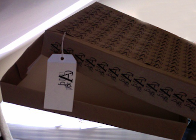 Here is my finished box and i am happy with how it has come out, i would prefer is my small Carson design covered every part of my box, but then i would have to print on all of my paper and i don't think i would be able to do it my self unless i screen printed, which i don't know how to do. all in all i am happy
Box
Thursday
Poster
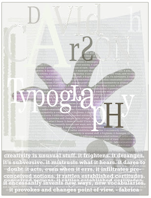 My poster was probable my favorite part of this assignment, i enjoyed constructing it from nothing, i used my own hand because it was easier, i used my hand because i thought it linked with the word typography which originates from a hand writing. i used very small faint text in the background to add depth. i also used some rough shapes as you may be able to see on the left hand side, they add depth and texture which is important when replicating Carson.
Inside
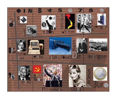 Here we have the inside of my gatefold leaflet which took ages to up load which is really annoying, i enjoyed making this as i learnt a bit about history, and design. i wanted to design it more but didn't want to over power the information from the 70's to 90's which i think was the most important part in David Carsons life
Problem!
I did come across one problem whilst doing this project, Printing! well i was ready for print made my way there and they told me as i got there that they won't take JPEGs though there website says they do, so i go back and change them to PDFs, go back and all of a sudden there is another problem as i had forgot to crop the images and had one side of my gatefold in portrait and one side in landscape. I asked if it would be possible for him to change it himself and he mentioned something about a £7.50 charge so i decided to do it my self, 3rd times a charm and it was and printing ended up really well and not that expensive, something like 4 or 5 pounds plus parking which i had to pay for 3 times!
Award Winning
David Carson is now a fully accomplished Graphic designer here are a few of his awards out of over 150
Best Overall Design, Society of Publication Designers
Cover of the Year, Society of Publication Designers
Award of Best use of Photography in Graphic Design
Designer of the Year 1998, International Center of Photography
Designer of the year 1990, International Center of Photography
Master of Typography, Graphics Magazine
The Most Famous Graphic Designer on the Planet, Creative Review Magazine
Hello
nothing exciting
Wrapping Paper?
Wednesday
Trek.
Trek is a piece which i shouldn't like as i have mentioned about the bright colours, but this piece i think is very well done and i really like it, though i still think i will be aiming for his darker side or maybe a bit of both. this image below is good but there are still bad points as well for example i don't like purple shape above the K though i really like the way he has the word 'trek' with parts over lapping.
Research - David Carson
David Carson has many pieces of work which i and many others like, above is another favorite of mine with great composition, looks like two images placed together as one is light and one is dark, still using the edgy messed up text which looks good, having colours which contrast each other like black and white the perfect example.
Research- David Carson
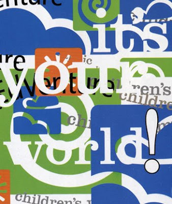 Another piece of David Carson, as you can see form the previous image it is very different with smooth rounded shapes and bright colours, there are still some consistencies like how it is very messy and hard to read, though it is different i don't really like it as much as his other works so i will not be replicating it
Research-David Carson
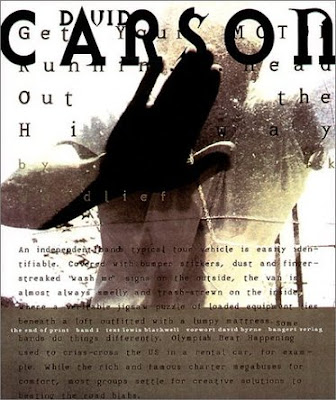 when starting research i was from the beginning sure who i was going to do as it was the only one which interested me at all, David Carson as his styles are always so different yet similar as they are rough and messy and unclear yet there is something to them as i will see. so far this one is my favorite i think it has a good composition, it's dark and light they eye is drawn to the 'CARSON' at the top. textured background adding depth, use of limited colours. i will use these techniques when making my pieces
Time Capsule
We received our new project which is to make a time capsule. after looking at the brief i wasn't happy with what we where doing as i felt making a cardboard box seemed a bit..... just my opinion of course i will do it. There are parts which intrigue me like the poster and gatefold leaflet, the only computer design elements. as i know little to nothing on most of the artists and time periods given to us i assume i will go for david carson as his work is most recent and most interesting.
let's see how i get on!
Subscribe to:
Comments (Atom)


